
Here are some proposed graphics.

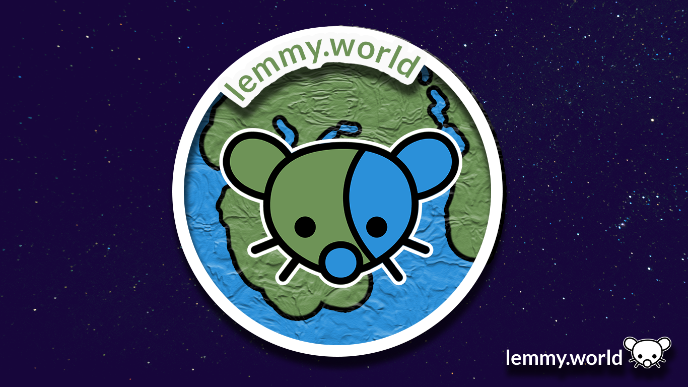


EDIT: I've now made a repository on GitHub, so that you can download the graphics and use them for your communities and projects. There's even an Etsy store selling stickers now.

Welcome to the official Lemmy.world Support community! Post your issues or questions about Lemmy.world here.
This community is for issues related to the Lemmy World instance only. For Lemmy software requests or bug reports, please go to the Lemmy github page.
This community is subject to the rules defined here for lemmy.world.
To open a support ticket
You can also DM https://lemmy.world/u/lwreport or email [email protected] (PGP Supported) if you need to reach our directly to the admin team.

Here are some proposed graphics.
EDIT: I've now made a repository on GitHub, so that you can download the graphics and use them for your communities and projects. There's even an Etsy store selling stickers now.
I love it
this looks great imo!!
Adorable, I love the ones with the earth in the background.
I like the first one the best, but the second one is also great. But they all look awesome.
I personally like the little lemming logo, but there could be a benefit of a more universally liked aesthetic that isn’t a rodent.
Everyone should start setting this to their profile picture on Reddit before we bail out forever. :)
Why can't it be a cat!
No reason why it couldn't be!
I think [email protected] would love a themed logo, with extra whiskers and cat ears! ♥️
Got 6 cats in my farm house back home in Australia and the number of mice they kill a week is in the double digits. Before I got them I had a burning hatred towards the little buggers.
I like the three last most in order 3 5 4. I do also really like 1 and 2 but the texture on the planet makes them difficult and a bit weird to look at in a small size, at least from the look at the post thumbnail.
#2 looks a bit forced imo. #1 is better.
It won't help anyone to make a choice, but I love them all !
I like the last two, although the "world" part is less obvious.
The 4th one is definitely the most readable regardless of sizing.
I've now made a repository on GitHub, so that you can download the graphics and use them for your communities and projects. There's even an Etsy store selling stickers now.
congrats man, your logo is now showing on this site
I'm pretty hyped. I still have some edits to do and items to add/shift, and to send over to Ruud later. But this is going both on the fridge and into the resume! 🤣
Love it!
I like #1 and #2 for the banner but the globe should be different colors than the mouse
Ohh.. I really like these! If you want to do a banner for [email protected], that would be awesome! We need one...
I'm complimented by the request!
I recommend... Checking in with your community, first. I've always found when there is a group of folks who get together, and create together, form some really amazing bonds. So perhaps give your team on your community a swing at a banner first.
And, if no one puts their hand up, let me know in a month, and I'll see what I can do!
Dont really like any of them. They are to busy for no real benefit. The logos are not unique enough that you would instantly recognize them. Because they are not better than the current generic earth picture I say we just leave it.
We need one of Apollo’s icon guys.
Oh, I love their work.
One user exported all of their icons. I've been flipping through them ever since.
Why a mouse? Seems a few Lemmy instances have a mouse as a logo / mascot.
Ah! It's an inherited piece of artwork, based on the mother instance, err, or the original instance of Lemmy.ml and the open source project itself. It's a bit of a nod to the musician, the Mario character, an old video game, and, of course, the adorable critter.
The Mario character is named after the musician, so I found that point odd when I first read it.
Excellent to know. Thank you!