this post was submitted on 23 Feb 2025
277 points (96.0% liked)
Data is Beautiful
5366 readers
63 users here now
A place to share and discuss visual representations of data: Graphs, charts, maps, etc.
DataIsBeautiful is for visualizations that effectively convey information. Aesthetics are an important part of information visualization, but pretty pictures are not the sole aim of this subreddit.
A place to share and discuss visual representations of data: Graphs, charts, maps, etc.
  A post must be (or contain) a qualifying data visualization.

  Directly link to the original source article of the visualization
    Original source article doesn't mean the original source image. Link to the full page of the source article as a link-type submission.
    If you made the visualization yourself, tag it as [OC]

  [OC] posts must state the data source(s) and tool(s) used in the first top-level comment on their submission.

  DO NOT claim "[OC]" for diagrams that are not yours.

  All diagrams must have at least one computer generated element.

  No reposts of popular posts within 1 month.

  Post titles must describe the data plainly without using sensationalized headlines. Clickbait posts will be removed.

  Posts involving American Politics, or contentious topics in American media, are permissible only on Thursdays (ET).

  Posts involving Personal Data are permissible only on Mondays (ET).
Please read through our FAQ if you are new to posting on DataIsBeautiful. Commenting Rules
Don't be intentionally rude, ever.

Comments should be constructive and related to the visual presented. Special attention is given to root-level comments.

Short comments and low effort replies are automatically removed.

Hate Speech and dogwhistling are not tolerated and will result in an immediate ban.

Personal attacks and rabble-rousing will be removed.

Moderators reserve discretion when issuing bans for inappropriate comments. Bans are also subject to you forfeiting all of your comments in this community.
Originally r/DataisBeautiful
founded 2 years ago
MODERATORS
you are viewing a single comment's thread
view the rest of the comments
view the rest of the comments
Unfortunately, this graph doesn’t consider that one incident can skew the data strongly because large incidents don’t happen yearly. (And the last incident of this magnitude was This means you can’t infer a trend from this graph alone.
If you include dates back to the 1990s, things look a lot worse then than now.
Was 2001 a bad year because of 9/11?
9/11 deaths are usually not counted, but even when counted the spike is not as noticeable as you might think.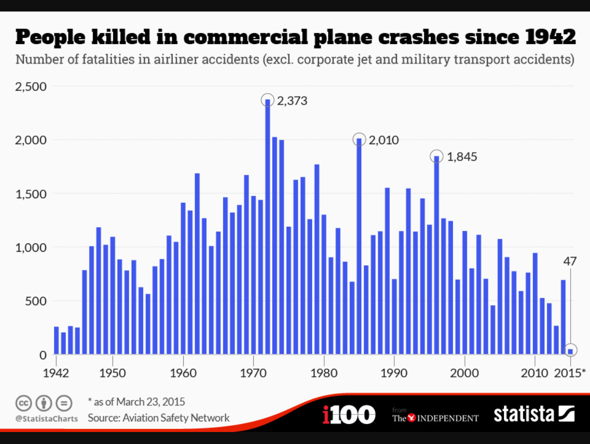 This graph shows data without 9/11, add 265 for the passengers and crew of the 4 planes. I think this graph is also the entire world and not just the USA.
That one bad incident (I assume you mean the helicoptor crash) had 67 fatalities. If you remove it, you still get 19 across 4 accidents, which is still way worse than previous years
This should be in the title. This makes the data more intresting.
But have you considered it's still only February