this post was submitted on 21 Oct 2023
413 points (98.1% liked)
Data Is Beautiful
7170 readers
1 users here now
A place to share and discuss data visualizations. #dataviz
founded 4 years ago
MODERATORS
you are viewing a single comment's thread
view the rest of the comments
view the rest of the comments
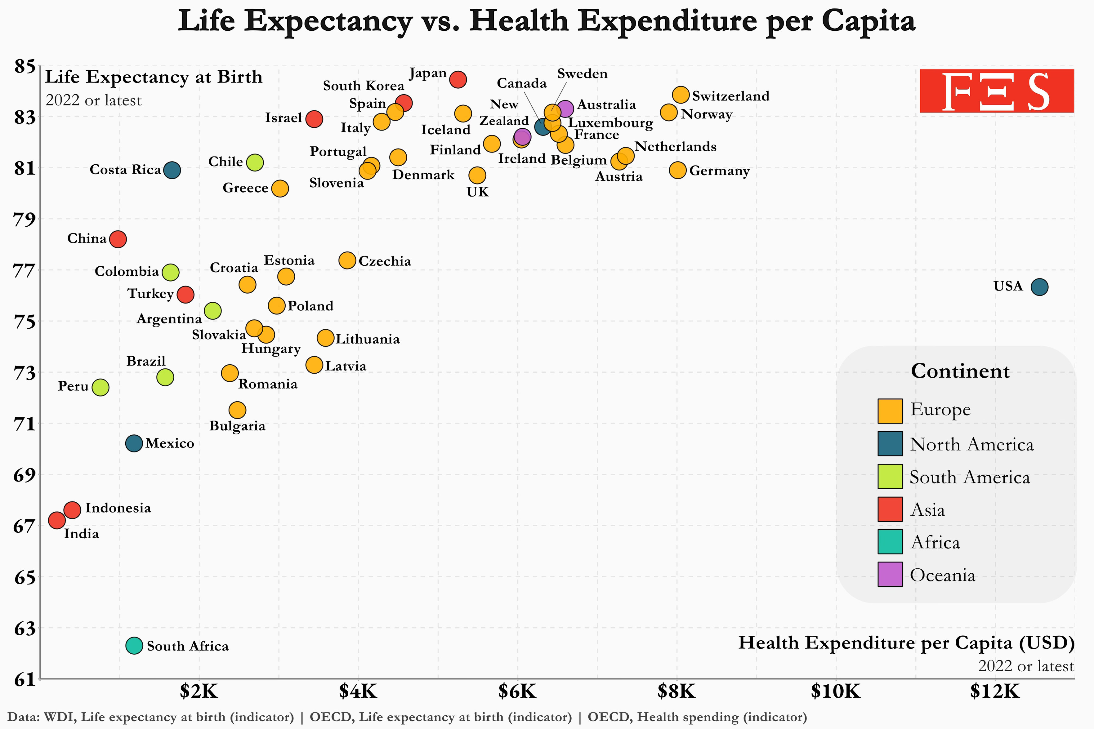
Further, is that number to include government healthcare funding, as well as out-of-pocket expense, in other words, money spent on behalf of the individual?
I’d like some clarity as this chart on its face is pretty damning.
It has to be, otherwise most of Europe would be along the y-axis.