this post was submitted on 30 Oct 2023
404 points (96.5% liked)
Data Is Beautiful
7133 readers
1 users here now
A place to share and discuss data visualizations. #dataviz
founded 4 years ago
MODERATORS
you are viewing a single comment's thread
view the rest of the comments
view the rest of the comments

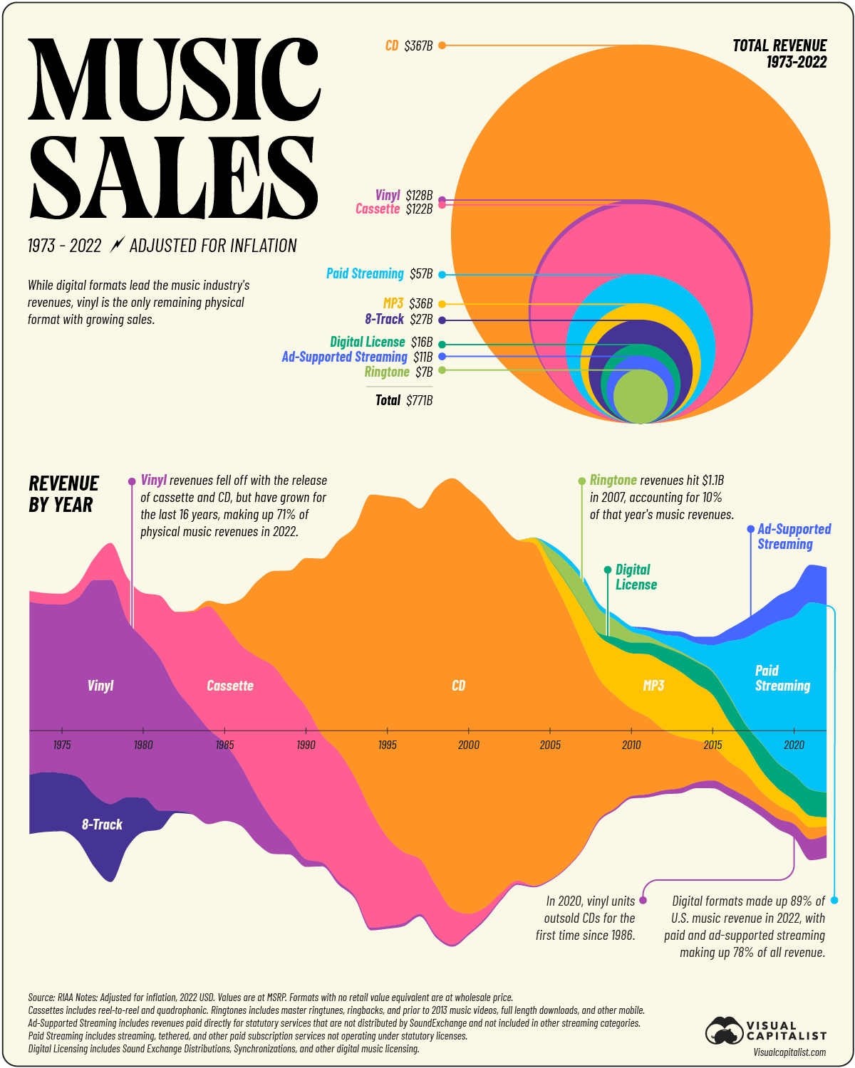
It would have been less confusing to have vertical lines rather than an x axis however they wanted it to look like a soundwave. However even though I am an electronic musician who works with soundwaves I didn't notice the metaphor until reading the comment here.