146
Post funny things about programming here! (Or just rant about your favourite programming language.)
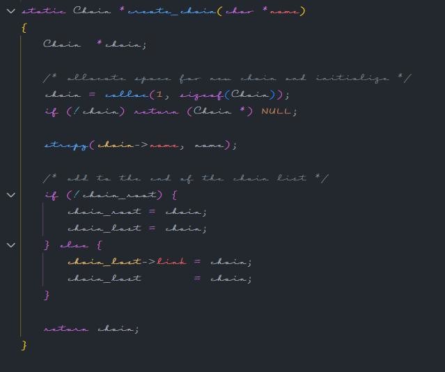
Is that monospaced? I am both horrified and impressed.
Wondering if there is a monospace cursive font.
Some fonts express cursive elements whem italisised though.
I mean, are we sure the font used in that screenshot isn't monospace?
If you compare the two lines after the first comment, the columns seem to align quite well (though I cannot read some of that)...
Yeah it does look monospaced.
Wait, you can read any of that? Impressive
Well, it helps a lot that I can guess the words from just knowing roughly what C looks like.
For example, the first line, I'm rather sure, reads:
static Chain *create_chain(char *name)
The only word I'm truly sure about, is "Chain", and I can mostly read "name".
The "static" and ”char", I would not be able to make out, without knowing that they're keywords in C.
And the "create" is pretty much unreadable to me, but it would make sense to be "create_chain", since it returns a Chain object.
Ah, I see. My C skills could use some brushing up
Operator Mono
While I haven't ascended to fully cursive coding, I do actually enjoy Fantasque Sans for this very reason.
It manages to kind of connect the letters in some ways that my eyes can better see single words as "tokens". After using it for a while, going back to a regular monospaced font looks like a speadsheet of unconnected letters.
Yep, not only did it take me years to unfuck my writing and the fastest handwriting I've ever had was not in cursive, I also nowadays do so little handwriting that my hand will start cramping after a few sentences...
I was fortunate enough to escape cursive, though everyone kept assuring I would have to learn eventually.
anyone know which font this is?
This is cursed.