Vexillography

54 readers
2 users here now

A community for vexillography.

Vexillography is the art and practice of designing flags; it is different, though related, from Vexillology.

Rules

  1. Posts should be relevant to Vexillography.

founded 3 years ago
MODERATORS
1


Context

The MRA is a socialist country ruled by machines; humans are also welcome. It is the successor to Alaska.

At some point in the 2050s, a Marxist programmer got exiled to Alaska. He got bored and decided to make some robots. The robots became Marxist and started a revolution; they perceived capitalism as wasteful and hated it as much as other marginalized minorities.

In the late 2060s, they managed to recuperate Alaska and form a socialist country.

Design

The gear and sickles form a template mounted moose head.

  • The sickles at the top symbolize the antlers.
  • The gear forms a head-mount shapae.

Hammers are there just to be cool.


SVG Pastebin.

2


Context

I really liked the direction of this flag. Some people wanted a star, and I wanted one, so I added one star (for a federal socialist country).

Description

The charge represents an eagle facing it's wings and beak (black trapezoid) towards a star (representing a socialist federal country).

Self-criticism

I probably should have used the blunt edge of the hammers as a beak, considering the blunt side of the hammer is the commonly used side; but that would look weird because beaks are always a triangle... right?

Link to the original flag in SVG.

War-Flag variant.

Context

I noticed that the wings formed a heart shape; vertically flipping the wings, the flag looked like the bird was protecting something, so I elaborated on that approach. The birds face downward, like they are protecting the star.

The original flag; but the wings are flipped vertically and the hammer-and-eye-s have moved up. The star has flipped positions.

Link to the variant flag in SVG.

3


(Now if only the U.S could turn socialist…)

Context

A flag designed for a socialist U.S. The charge is supposed to be an eagle in a socialist style.

I didn't use the white and blue colors; because they have derogatory meanings.


SVG file.

4


[Image description: a “Straight Diagonal” version of the Disability Pride Flag: A muted black flag with a diagonal band from the top left to bottom right corner, made up of five parallel stripes in red, gold, white, blue, and green Description ends]

Having All Six "Standard" Flag Colors: signifying that Disability Community is pan-national, spanning borders between states and nations.

The Black Field: Mourning and rage for victims of ableist violence and abuse

The Diagonal Band: "Cutting across" the walls and barriers that separate the disabled from normate society, also light and creativity cutting through the darkness

The White Stripe: Invisible and Undiagnosed Disabilities

The Red Stripe: Physical Disabilities

The Gold Stripe: Neurodivergence

The Blue Stripe: Psychiatric Disabilities

The Green Stripe: Sensory Disabilities

Source: https://libredd.it/r/disability/comments/uhhdbv/the_disability_pride_flag_by_ann_magill_me_has/

5


Context

Efficientism is a belief (I made up) in which efficiency should govern life. The economic systems of a country could change based on efficiency; clothing would be sold based on efficiency.

Design

  • Blue is water.
  • Yellow is energy (both from the sun and water).
  • The gear represents automation.
    • The brown half represents the waterwheel, which indicates the idea that only required effort should be utilized.
    • The red half represents communism. Greed is a problem for efficientism; because greed often strays from efficiency. Hence, the workers or majority population should be prioritized over minorities.
6


Context

This flag promotes the idea that wetware should be free and open source.

Design

The flag is a variant of the open-source hardware logo, with a background color.

  • The light-blue gear and pinkish keyhole is a variation of the open-source hardware logo; the colors are commonly found in neurons.
  • The yellow background symbolizes freedom.
7
1
submitted 2 years ago* (last edited 2 years ago) by Amicchan@lemmy.ml to c/vexillography@lemmy.ml


Context

This "flag" (I'm skeptical to call it a flag because it doesn't really look like one) promotes the idea that wetware should be open source.

Design

The flag is a variant of the open-source hardware logo.

  • The pinkish background and the light-blue gear represent the colors commonly found in neurons.
8


Context

A flag that promotes self-controlled privacy.

Design

  • The square bracket '[' references Matrix. It could also represent a shield or cover.
  • The closed eyelash (a curve with a triangle attached to it) symbolizes liberty in deciding when to open up private information.
  • The arrows represent reflections [of surveying eyes].
  • The background is a yellow, for liberty. I wish I chose grey instead, for the anonymity.
9


Context

A flag for socialist solidarity with the homeless or poor.

The charge has three weapons: tree branch, rocks, and a millwall brick. These objects are easy to find or make. (Trees and rocks are common across earth; newspapers are still in large quantity.)

The dotted-circle represents the open inclusion of homeless people who are not socialist.

10


Context

Enterprise Copyright is the idea that corporations can be copyrighted (beyond their death).

Design

The charge is a merge of the copyright symbol (©) and a capital E (the first letter in enterprise); this symbol represents enterprise copyright.

The background is blue because I haven't thought of a proper background yet.

11
 
 
12


I felt like making a flag with a similar reference to the hammer-and-sickle (☭); but as a bow (and arrow).

Flag in SVG

13


Context

This flag represents the egalitarian freedom of information.

Design

  • The yellow background implies liberty.
  • The magnifying glass represents information.
    1. The magnifying glass is vertically straight to represent the lack of bias.
    • The horns represent the GNU, which supports copyleft, horns. (It probably isn't neccessary imo.)

Here is the flag without the horns.

  • Yellow background represents liberty.
  • The magnifying glass is a symbol for information. It is horizontally aligned to represent the lack of bias.
  • The horns represent the idea of copyleft, supported by GNU.</dc:description> dc:subject rdf:Bag rdf:liinformation</rdf:li> rdf:lifree</rdf:li> rdf:lilibre</rdf:li> rdf:lignu</rdf:li> </rdf:Bag> </dc:subject> </cc:Work> <cc:License rdf:about="http://creativecommons.org/publicdomain/zero/1.0/"> <cc:permits rdf:resource="http://creativecommons.org/ns#Reproduction" /> <cc:permits rdf:resource="http://creativecommons.org/ns#Distribution" /> <cc:permits rdf:resource="http://creativecommons.org/ns#DerivativeWorks" /> </cc:License> </rdf:RDF>

Flag in SVG

Rendered flag.

  • Yellow background represents liberty.
  • The magnifying glass is a symbol for information. It is horizontally aligned to represent the lack of bias.
  • The horns represent the idea of copyleft, supported by GNU.</dc:description> dc:subject rdf:Bag rdf:liinformation</rdf:li> rdf:lifree</rdf:li> rdf:lilibre</rdf:li> rdf:lignu</rdf:li> </rdf:Bag> </dc:subject> </cc:Work> <cc:License rdf:about="http://creativecommons.org/publicdomain/zero/1.0/"> <cc:permits rdf:resource="http://creativecommons.org/ns#Reproduction" /> <cc:permits rdf:resource="http://creativecommons.org/ns#Distribution" /> <cc:permits rdf:resource="http://creativecommons.org/ns#DerivativeWorks" /> </cc:License> </rdf:RDF>
14


This flag represents universal apologeticism (the idea that everyone should be allowed to apologize).

Design

  1. The black background is symbol for anarchist thought; it represents that

  2. The red cross is a universal symbol for hospitality.

  3. The halo represents the idea of forgiveness.

  • Yellow represents liberty..
  • White represents purity.

Alternative design Rotated

Black background with a Yellow-White ring surrounding a red cross.

I rotated the red cross because I felt like it; (but it could represent the opposite of hospitality (inhospitality).

15


Context

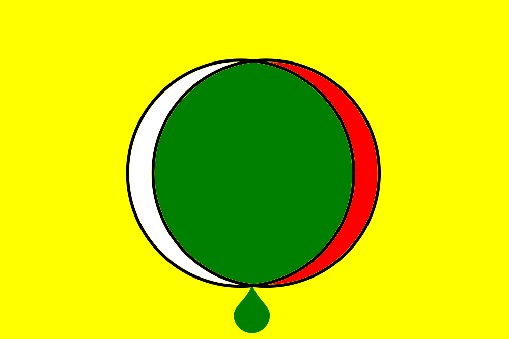
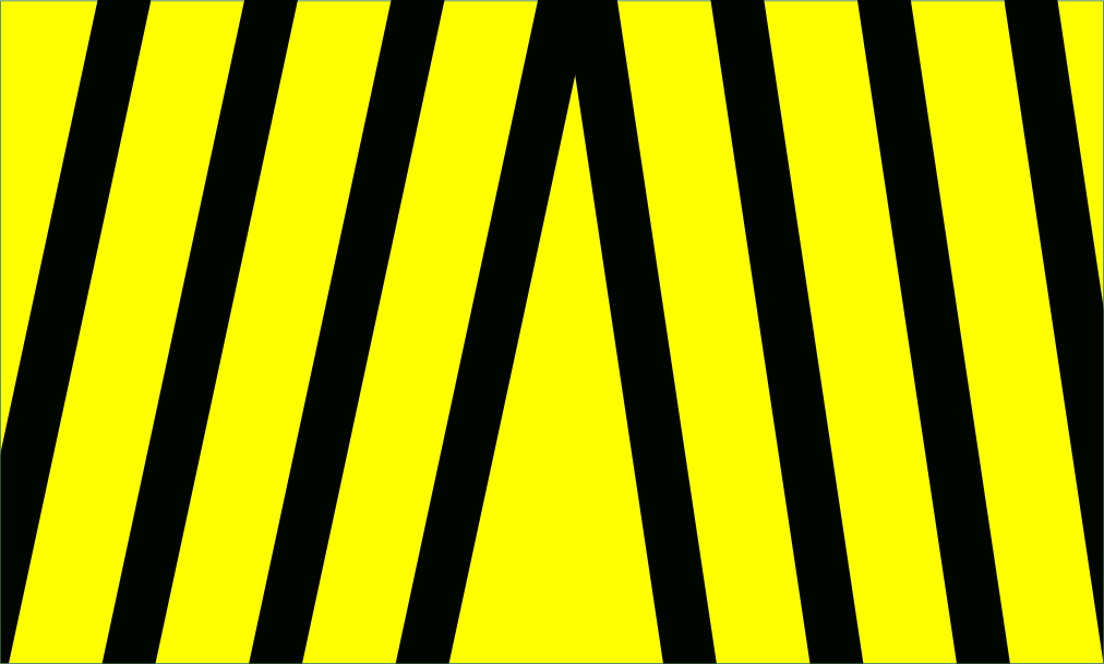
This flag represents a United States that became parasitic in the search for liberty.

Design

  • The dark red background symbolizes the original identity of the U.S (being the 13 colonies) being lost to time; it now represents unnecessary violence.

  • The dark blue circle is a throw back to the dark blue canton in the current U.S flag.

  • The yellow worm (supposed to be a hook worm) is a symbol of the U.S leeching off other countries (and people), sometimes to their detriment.

    • The thick geometric claws relate to the German Swastika; it symbolizes fascist traits in the U.S.

SVG Code

Here is the flag in Plain SVG.

<?xml version="1.0" encoding="UTF-8" standalone="no"?>
<svg
   xmlns:osb="http://www.openswatchbook.org/uri/2009/osb"
   xmlns:dc="http://purl.org/dc/elements/1.1/"
   xmlns:cc="http://creativecommons.org/ns"
   xmlns:rdf="http://www.w3.org/1999/02/22-rdf-syntax-ns"
   xmlns:svg="http://www.w3.org/2000/svg"
   xmlns="http://www.w3.org/2000/svg"
   xmlns:xlink="http://www.w3.org/1999/xlink"
   id="svg1027"
   version="1.1"
   viewBox="0 0 7410 3900"
   height="650"
   width="1235">
  <metadata
     id="metadata1033">
    <rdf:RDF>
      <cc:Work
         rdf:about="">
        <dc:format>image/svg+xml</dc:format>
        <dc:type
           rdf:resource="http://purl.org/dc/dcmitype/StillImage" />
        <dc:title></dc:title>
      </cc:Work>
    </rdf:RDF>
  </metadata>
  <defs
     id="defs1031">
    <linearGradient
       osb:paint="solid"
       id="linearGradient1556">
      <stop
         id="stop1554"
         offset="0"
         style="stop-color:#000000;stop-opacity:1;" />
    </linearGradient>
    <pattern
       patternTransform="translate(-1.5169271e-5)"
       id="pattern29"
       xlink:href="#pattern2870" />
    <pattern
       id="pattern2870"
       patternTransform="matrix(6,0,0,6,3648.8732,306)"
       height="36.180333"
       width="38.042267"
       patternUnits="userSpaceOnUse">
      <path
         d="M 19.021133,0 30.776833,36.180333 0,13.819667 H 38.042267 L 7.2654333,36.180333 Z"
         id="use1007"
         style="fill:#ffffff;stroke-width:0.16666667" />
    </pattern>
    <pattern
       id="pattern1681"
       patternTransform="matrix(6,0,0,6,3723.8733,396)"
       height="36.180333"
       width="38.042267"
       patternUnits="userSpaceOnUse">
      <rect
         style="fill:url(#pattern29);stroke:none;stroke-width:0.16666667"
         width="38.042267"
         height="36.180332"
         x="0"
         y="0"
         id="rect2873" />
    </pattern>
  </defs>
  <circle
     r="1459.4684"
     cy="1794"
     cx="3846"
     id="path27-6-3"
     style="opacity:1;fill:#3c3b6e;fill-opacity:1;stroke:none;stroke-width:300;stroke-linecap:butt;stroke-linejoin:round;stroke-miterlimit:4;stroke-dasharray:none;stroke-dashoffset:0;stroke-opacity:1" />
  <g
     transform="matrix(2.0122697,0,0,2.0122697,-3807.8583,-1934.4735)"
     id="layer1">
    <path
       transform="translate(-924.89567,-280.01429)"
       id="path1066"
       d="m 4692,2742 c -105.9931,2.0383 -207.9939,3.9999 -257.9967,-38.0057 -50.0028,-42.0057 -46.003,-128.0006 5.0167,-171.9978 51.0197,-43.9973 148.9861,-45.9966 271.9815,-48.9965 122.9955,-2.9999 271.0047,-7.0002 343.0016,-70.0004 71.9969,-63.0003 67.9967,-185.0054 -11.9968,-253.0019 -79.9935,-67.9965 -235.996,-81.9968 -376.0012,-107.9973 C 4525.9999,2026 4402.0038,1988.0012 4397.0072,1920.9961 4392.0106,1853.991 4506.0065,1757.9946 4620,1662"
       style="fill:none;stroke:#ffff00;stroke-width:23.99976504;stroke-linecap:butt;stroke-linejoin:miter;stroke-miterlimit:4;stroke-dasharray:none;stroke-opacity:1" />
    <path
       id="path1070"
       d="m 3899.4401,1286.3008 -24.6214,117.0736 -179.7144,-21.3887 -6.8155,-174.477 128.7276,-13.2472"
       style="fill:none;stroke:#ffff00;stroke-width:42;stroke-linecap:butt;stroke-linejoin:miter;stroke-miterlimit:4;stroke-dasharray:none;stroke-opacity:1" />
    <path
       id="path1074"
       d="m 3919.3543,2443.6107 c -64.0049,-64.1299 -47.8052,-48.0552 -63.75,-64.125 -31.7102,26.6592 0,0 -97.3934,82.5"
       style="fill:none;stroke:#ffff00;stroke-width:30;stroke-linecap:butt;stroke-linejoin:miter;stroke-miterlimit:4;stroke-dasharray:none;stroke-opacity:1" />
    <use
       style="fill:#ffff00;fill-opacity:1;fill-rule:nonzero"
       transform="matrix(1,0,0,-1,3.601042e-8,4923.9714)"
       height="100%"
       width="100%"
       id="use1080"
       xlink:href="#path1074"
       y="0"
       x="0" />
  </g>
</svg>

16


This flag is an alternative free wetware flag to my previous design.

Flag design

  • The red sphere is the nuclei; the light-blue connection is the axom of a neuron. (They symbolizes a neuron.) They are used in wetware computers.
  • The black computer symbolizes hardware and software
  • Yellow background represents freedom.
17
1
submitted 3 years ago* (last edited 3 years ago) by Amicchan@lemmy.ml to c/vexillography@lemmy.ml


This flag advocates for free wetware: Free software applied to wetware.

Design

  • Yellow background represents freedom.
  • Black computer symbolizes hardware and software.
  • The water droplet specifies wetware.
18
1
submitted 3 years ago* (last edited 3 years ago) by Amicchan@lemmy.ml to c/vexillography@lemmy.ml


Antipedestrianist Flag

This flag represents the ideology of antipedestrianism.

The black background with a white and yellow line represents a road for cars, which symbolize that cars are superior.

The pedestrian inside the no symbol represents the core antipedestrianist belief.

Cars are greater than (other transportation)

This flag represents the idea that cars are superior to other forms of transportation.

The black background with ~~a white line and yellow line~~ white lines represents a road for cars. (There are no yellow lines; because I wanted this flag to be understood globally; not just in the US or Eurasia.)

The yellowed > is a symbol for greater than; the symbol communicates that cars are superior to other forms of transportation.

19


This flag is an alternate design to my original flag.


The two circles with are inspired by the Flaming chalice symbol.

  • Red symbolizes violence
  • White symbolizes peace.
  • Green symbolizes achieving a goal.

The hoist is the place of honor on a flag, so the white color on the left circle represents that peace is preferred for reaching solutions; but violence will sometimes be used if peaceful methods do not work.

The left and right circles have the same width; which represent that both methods are used in a fair manner.

(This is an icon to represent the idea that while peace is the preferred method to peace; there are other methods that can more efficiently result in peace.)

The droplet is green because it symbolizes that violence can accidentally occur when trying to accomplish peace or a goal.

Potential Edits

The height of the white and red can symbolize the level of peace or violence used; a short white can represent the level of peace used; a shorter red can represent the level of violence used.


The yellow background symbolize the liberal methodology of this "philosophy".

20


SVG should be supported. (Change my mind!)

21
22


I updated my anarcho-syndicalist Valentine’s Day to properly signify the rejection of the capitalistic western idea of Valentine’s Day.

23


I wish I could have detailed the gears better.