this post was submitted on 15 Nov 2024
150 points (99.3% liked)
Don't Dead - Open Inside
1200 readers
2 users here now
Images of text-designs, that are barely readable due to the placement of the words or letters
Please indicate which post is original by writing "OC" and properly credit stolen posts.
Please mark NSFW posts properly, don't spam, yadadadada
founded 1 year ago
MODERATORS
you are viewing a single comment's thread
view the rest of the comments
view the rest of the comments
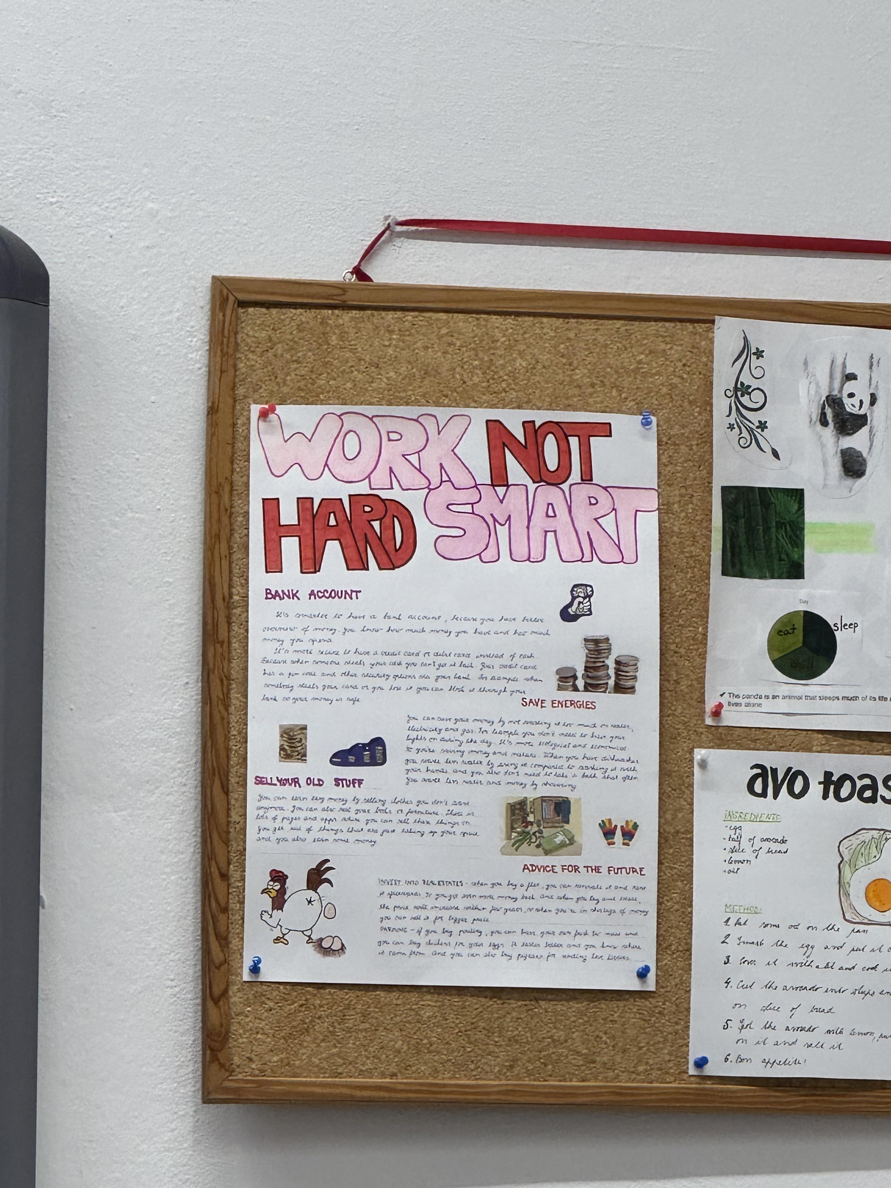
It's either "work not hard smart" or "work hard not smart". Either way it doesn't exactly inspire confidence.
You're supposed to read pink, then red, basically like an x... incredibly confusing.
Even then it doesn't work:"work smart hard not"
It does, if you read it like this:
I.e.: like no one ever read anything
What you
mean do
.
I read like
that. everything
At least they got the top left correct.
Don't work hard indeed.