this post was submitted on 27 Feb 2025
383 points (98.0% liked)
Data Is Beautiful
8378 readers
17 users here now
A place to share and discuss data visualizations. #dataviz
founded 4 years ago
MODERATORS
you are viewing a single comment's thread
view the rest of the comments
view the rest of the comments
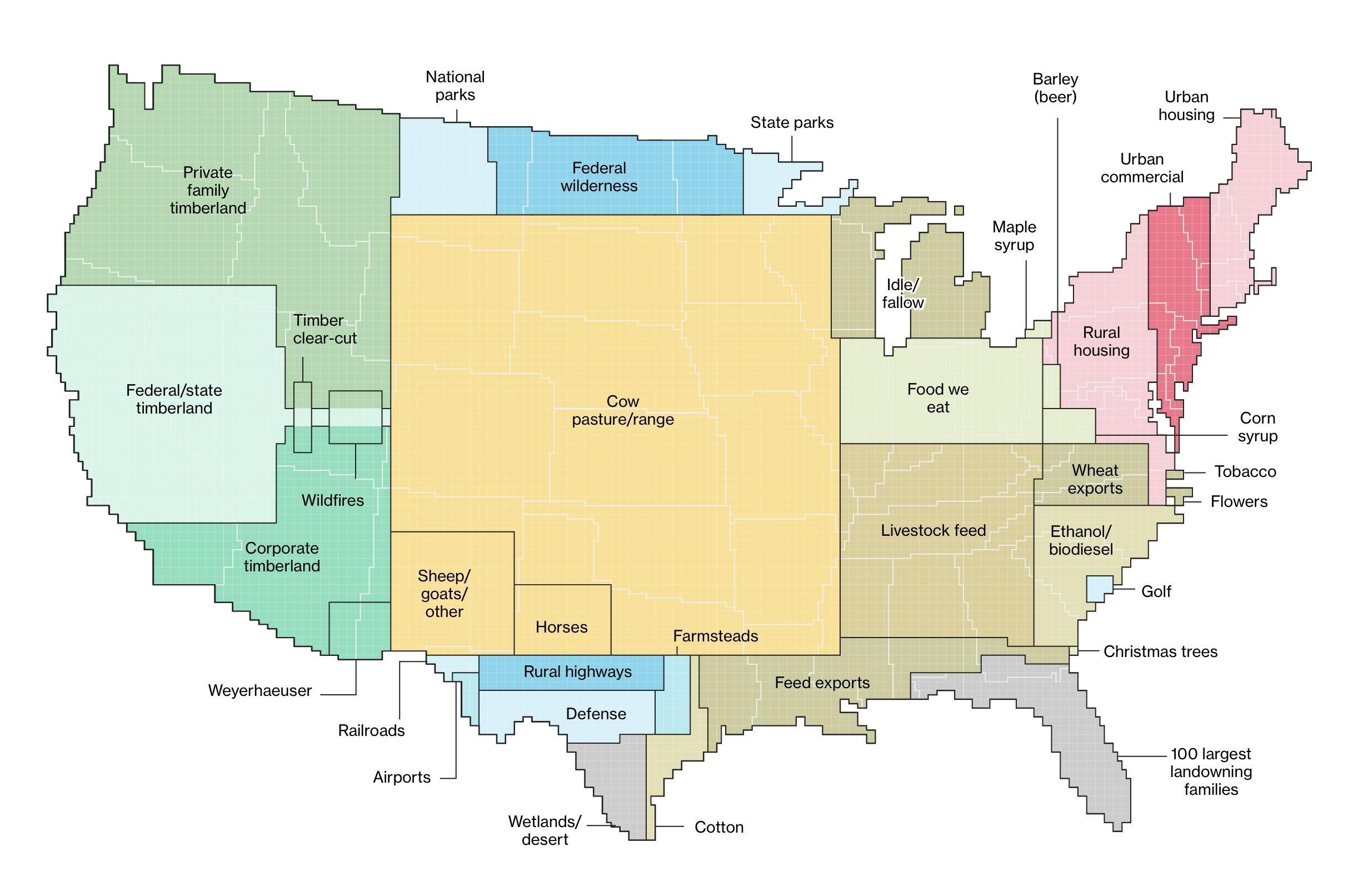
It's quite interesting that "rural highways" is one of the categories identified, but not any other sort of improved road. The data source has a base granularity where one square is 250,000 acres (~100,000 hectares), and then additional state data is factored in for increased precision. It supposingly being USDA data, they might primarily care only about those highways used to connect farms to the national markets.
That said, I would be keenly interested in the land used for low-volume, residential streets that support suburban and rural sprawl, in comparison to streets in urban areas. Unlike highways which provides fast connectivity, and unlike dense urban-core streets that produce value by hosting local businesses and serving local residents, suburban streets take up space, intentional break connectivity (ie cul de sacs), and ultimately return very little in value to anyone except to the adjacent homeowners, essentially as extensions of their privately-owned driveways.
It may very well be in USDA's interest to collect data on suburban sprawl, as much of the land taken for such developments was perfectly good, arable land.
I love this visualization and for some reason your comment made me also wish we had this data correlated with the water usage for each land use category.
There'd be a square or two which just say "Nestlé" lol