this post was submitted on 14 Jan 2022
2 points (100.0% liked)

COVID-19 Pandemic

978 readers
1 users here now

Any news or discussion around the pandemic. Anti-vaccination posts and comments will be removed, as well as personal attacks.

Relevant:

founded 3 years ago
MODERATORS
 

all 9 comments
sorted by: hot top controversial new old
[–] [email protected] 2 points 3 years ago (2 children)

1 Great semi-quantitative representation
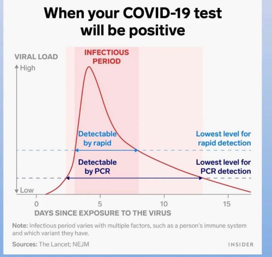
2 if it was quantitative, vertical axis would-be logarithmic

An approximated answer to @[email protected] question is (?) ... in it's footnote :

infectious period varies with multiple factors, such has a person's immune system and which variant they have.

[–] [email protected] 1 points 3 years ago (1 children)

Well the axis isn't labeled, so it could be log scale. It could also be any random range chosen by the graph maker. It looks linear though.

Quantitative just means that it is represented in numbers. It doesn't have anything to do with the scale used on a graph. Log scales do work better for analysis and deeper understanding of population data (like virus loads), but they are much less intuitive for most readers. These are absolutely quantitative data.

[–] [email protected] 1 points 3 years ago (1 children)

virus multiplication is quite logarithmic ... i could find supporting data, but i am sure you know this already.

[–] [email protected] 2 points 3 years ago (1 children)

No need for supporting data. Virus populations definitely have exponential growth. I was just being pedantic about what quantitative means.

[–] [email protected] 1 points 3 years ago (1 children)

So it could have been :
semi-logarithmic graph
"In science and engineering (...) a semi-logarithmic plot/graph has one axis on a logarithmic scale, the other on a linear scale."

But here :
1 one axis has the scale : "low ... high" (which is qualitative),
2 the other has a linear scale (which is quantitative).
so in this case and in this context :
semi-quantitative seems fitting(?).

[–] [email protected] 1 points 3 years ago

Ah, I see where you're coming from.

[–] [email protected] 1 points 3 years ago* (last edited 3 years ago)

... also theoretically one single virus copy (viral particle) could produce an infection, what i mean is that "infectious period" has gray zones.

[–] [email protected] 0 points 3 years ago

The "infectious period" label is kind of ambiguous. I'm still not sure if it's referring to the darker pink band or the darker plus lighter pink bands. Probably should have used arrows for that too.