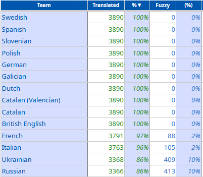
Australia is the next country after Ethiopia, but it's not outlier in this case.
LabPlot
You can read more on boxplots here:
@maulanahirzan @[email protected]
Thank you for sharing your opinion. We love to hear that you enjoy using #LabPlot. We invite you to also subscribe to our LabPlot YouTube channel.
14/ The last of Paul F. Velleman's aphorisms refers to the value of conflicting explanations.
#DataAnalysis #DataScience #Analytics #Data #DataAnalytics #DataViz #DataVisualization #Science #Statistics #Math #STEM #FOSS #OpenSource #KDE #Education #Business #LabPlot
13/ Another of Paul F. Velleman's aphorisms is related to the co-evolution of different aspects of data analysis.
➡️ The data analysis process rarely proceeds in an orderly march from question to answer.
➡️ Software that requires us to know the question before we can seek answers hinders real data analysis.
#DataAnalysis #DataScience #Analytics #Data #DataAnalytics #DataViz #DataVisualization #Science #Statistics #Math #STEM #FOSS #OpenSource #KDE #Education #Business #LabPlot
Let's just assume that the Christmas tree includes a test to check if our readers are humans 🙂
The process average X and control limits are added to the plot for men. The average is 63.4. The upper control limit (UCL) is 64.8 and the lower control limit (LCL) is 62.0.
The UCL represents the largest value you would expect if you only have common causes of variation present. The LCL represents the smallest value you would expect if you only have common causes of variation present.
@dataisbeautiful [email protected] [email protected]
@Generous1146
Actually, it looks more like the disability-free life expectancy has increased in 2015 and since then stays at about the same level.
#DataViz #Statistics #Visualization #Health #Disability #LabPlot #OpenSource #FOSS
@smeg
The points are jittered along the x-axis, otherwise the data points could overlap.