this post was submitted on 22 Apr 2025
460 points (97.7% liked)
Fuck AI
2518 readers
1216 users here now
"We did it, Patrick! We made a technological breakthrough!"
A place for all those who loathe AI to discuss things, post articles, and ridicule the AI hype. Proud supporter of working people. And proud booer of SXSW 2024.
founded 1 year ago
MODERATORS
you are viewing a single comment's thread
view the rest of the comments
view the rest of the comments

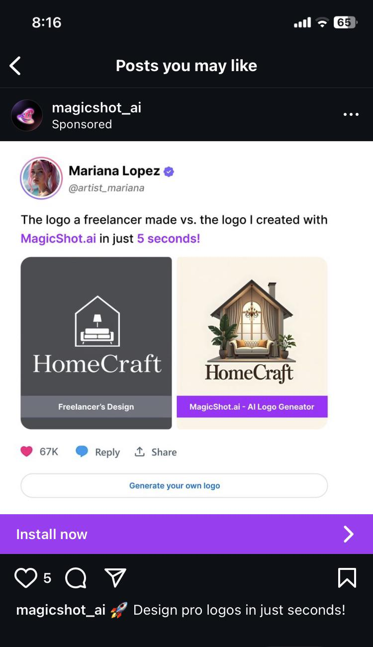
Honestly, from a design perspective I do think the one on the right is actually better in some respects. Yes, it wouldn't scale well, there's too many colours, it's too busy, but it has some good points. The font choice draws you in more, with less space between the letters making it easier to read at a glance and the 'f' creating interest. And the house is actually united with the text, whereas in the left image it feels completely disconnected.
I would be pretty disappointed if I'd paid for a logo and I got the left image tbh, it's not very interesting or memorable. Yes, fuck AI, but I'm not sure this is the best comparison because both logos suck in different ways.
I wouldn't be surprised if she paid $5 on Fivr for the logo on the left just so she could say it's from a freelancer.