this post was submitted on 13 Jul 2025
319 points (92.1% liked)
196
18057 readers
739 users here now
Be sure to follow the rule before you head out.
Rule: You must post before you leave.
Other rules
Behavior rules:
- No bigotry (transphobia, racism, etc…)
- No genocide denial
- No support for authoritarian behaviour (incl. Tankies)
- No namecalling
- Accounts from lemmygrad.ml, threads.net, or hexbear.net are held to higher standards
- Other things seen as cleary bad
Posting rules:
- No AI generated content (DALL-E etc…)
- No advertisements
- No gore / violence
- Mutual aid posts are not allowed
NSFW: NSFW content is permitted but it must be tagged and have content warnings. Anything that doesn't adhere to this will be removed. Content warnings should be added like: [penis], [explicit description of sex]. Non-sexualized breasts of any gender are not considered inappropriate and therefore do not need to be blurred/tagged.
If you have any questions, feel free to contact us on our matrix channel or email.
Other 196's:
founded 2 years ago
MODERATORS
you are viewing a single comment's thread
view the rest of the comments
view the rest of the comments
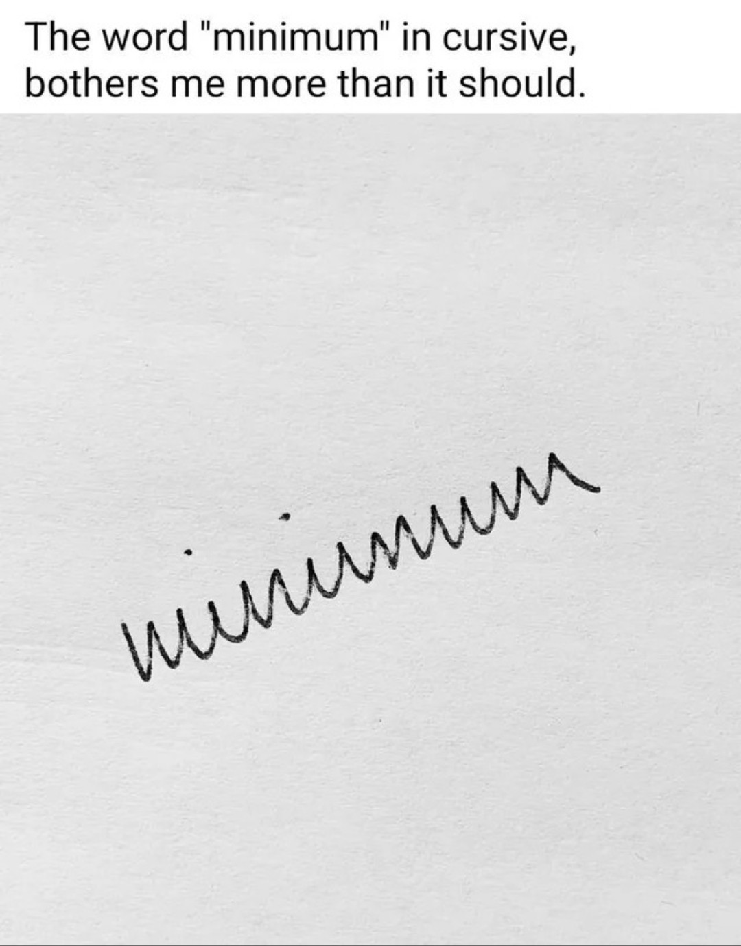
You can make it much more legible by just curving the parts that are susposed to be curved and not just doing jagged edges everywhere.
Strictly based on where the jagged points are and where the strokes end, I would say the word written was uůẃnwu.
Looks like vùnunww to me.
Also yeah you got it quite well.
winumwm
there are many ways to write cursive and differs per country .
I'm not even sure which method I'm taught. There's "Methode D'haese" and "Karakter" (a modern method).
Yeah you just described the correct and the incorrect way.
It's called writing garlands and is a mess for obvious reasons.
Yeah it makes it look like russian cyrilic cursive. That one actually is supposed to have more letters look that way.
Or the Serbian one.
Like this
Fortunately, my russian teacher wrote "normally", while I had to deal with basically this mess in German, where you only could separate the u from the n and the w from the m by the lines below the u and w.
That's a feature of a very old German hand writing style that hasn't been used much since WWII
Yet, Sütterlin looks different, as it often has vertical and diagonal straight lines where Latin script has round shapes. But likewise, it's difficult to read.
You're ruining the meme
Edit: didn't think I needed this: /s
Cannot ruin a bad faith argument. I can also write chickenscratch and fast but it still looks more legible than that.