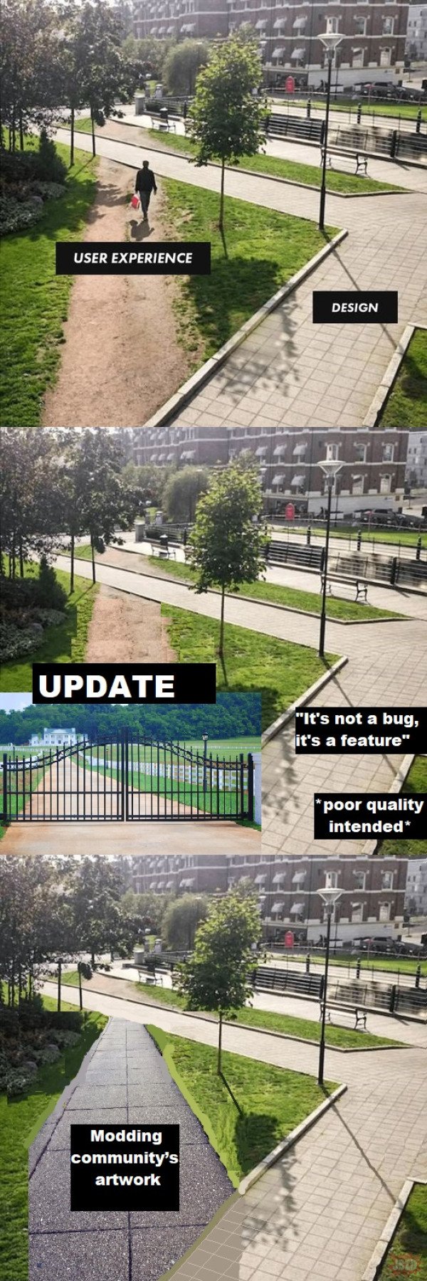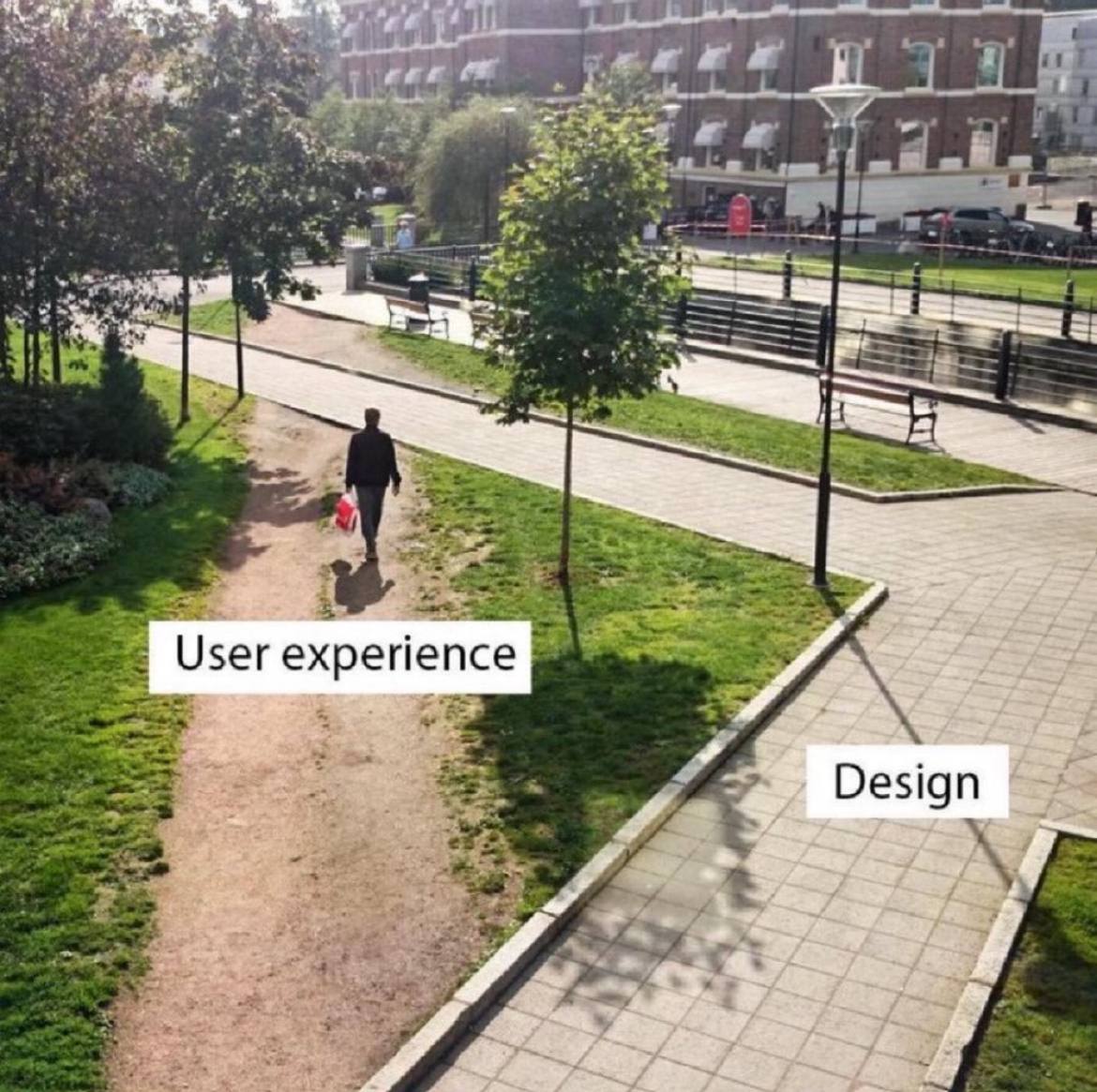
Pretty sure the user experience folk are screaming for a path to be built there but are getting ignored.
Post funny things about programming here! (Or just rant about your favourite programming language.)
Pretty sure the user experience folk are screaming for a path to be built there but are getting ignored.
They aren't being ignored. The corner needs to be a right angle for compliance reasons.
But the actual corner isn't even a right angled corner.
They were forced to cut corners in implementation.
Everyone says, they are not bringing their best angles. Triangles. Quadrangles. And some I assume are acute angles.
All I want is an angle who's acute and not right.
What we should do is put chainlink fence around the corner, but make the part that the users loved the most accessible with a monthly pass that they can only walk on with shoes purchased at the university store.
- spez
You mod 16 subs, what do you get?
Another day blocking API requests.
Saint Peter don’t DM me cuz I can’t go.
I owe my soul to Spez’s asshole.
It's important we do it that way for our 🌟brand identity🌟.
Management wants us to add more AI and Machine Learning so the user ends up in the parking lot.
How about a pond?
A lot of universities with large campus grounds take the approach of observing the natural foot traffic wear patterns on grassy areas, and then build walkways where the most worn down parts are.
Its... pretty obvious.
If everyone is taking an alternate, non designed path... your design sucks, modify it to facilitate what people find more effective.
These are apparently called “Desire Paths”
And there's a whole community for them! Not sure how to link to it though.
Just give the URL, I'll do a federated link for you.
!desire_[email protected]
Literally just put it in that way, for future notice - there's no hidden formatting here.
Same for users — just change the ! to an @.
Example: @[email protected]
At least on the official web app, that doesn't render as a link. You've got to do it as [whatever](u/[email protected])
Oh, that's annoying. Works fine on Voyager for me.
iirc it's what they did in central park. Don't create paths and later pave the desire paths that show up
Don’t underestimate youthful rebellion!
Whenever that happens, the design is wrong.
Fixed. Added a wall with razor wire on top to prevent this.
Ah yes, the hostile architecture approach.
In IT, sometimes there's security reasons for the designed detour.
But then good design would completely obstruct the shortcut from the user's view.
change log: We've adjusted the 20 year old UI to better reflect modern aesthetic trends that our new hires learned in school.
Works as intended. kthxbye
Designers need to wake up and realize their job is to understand what the user wants not what they saw in a wet dream.
I, unfortunately, have to use GitHub at $DAYJOB and this is me. I navigate most of the webpage via the URL bar now.
Basically, let's say I'm working on a repo github.com/tomato/sauce/ and want to navigate to the Releases page.
Via the webpage:
github.com into the URL bar.tomato/sauce/ in the list of recent repos, even though it's the only repo I work on.tomato/ org.tomato/ org.sauce/ repo in the list.Via the Firefox URL bar:
gi→t→s→r→.I admit, it's hard to compete with the latter, but I wouldn't know how to navigate that way, if the former wasn't so terrible.
What kind of sicko try to find their repos from the recent list on the main page??
Hopefully somebody else $DAYJOBs at GitHub and will see this.
This is me, but with my work's Azure DevOps. Nice to meet a fellow auto-complete bro.
"What the user needed" / "What management demanded"
That’s right, it goes in the square hole.
That's ancient.
Uhh, so looking carefully at the picture, it appears they shouldn't have bothered with the inner pathway at all, and should have just connected the bridge over the canal (?) in the background to whatever is under the camera.
Not only does the current design fail to provide a short path in demand, it leaves a goofy little boulevard behind the benches in what appears to be a dense, desirable urban area where you shouldn't waste space.
Needs more plants.